menu

WebPlatform Documentation

Campaign Cost Over Time Report

Summary

The campaign overtime report tracks the cost of a campaign from the start of the campaign to the end of the campaign. The report tracks the following metrics:

  • Last Sync Date Time and Next Sync Date Time
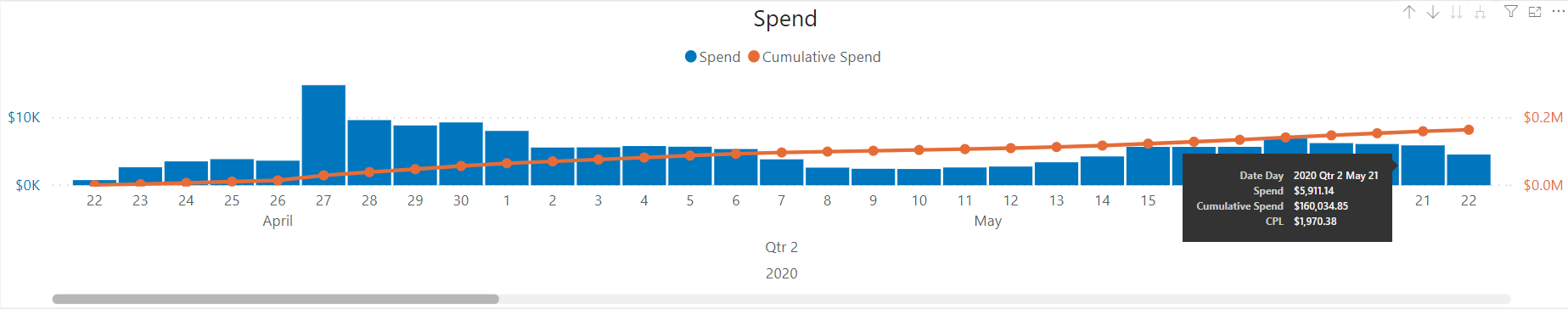
  • Total and cumulative spend
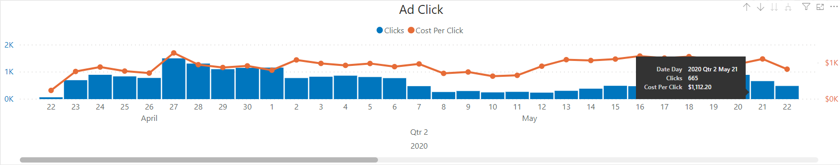
  • Total clicks and cost per click
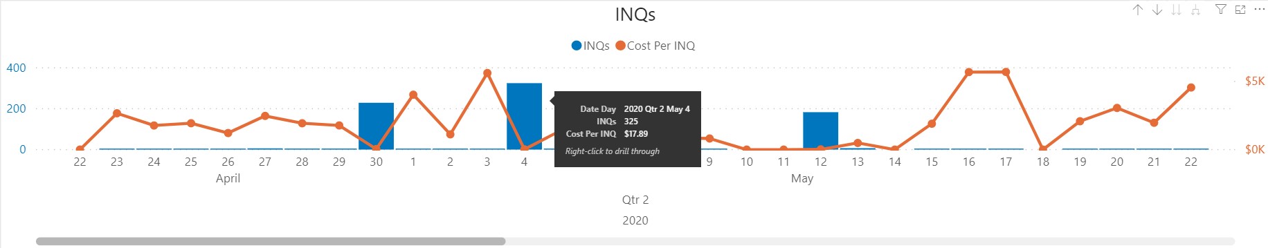
  • Total INQs and Cost Per INQ
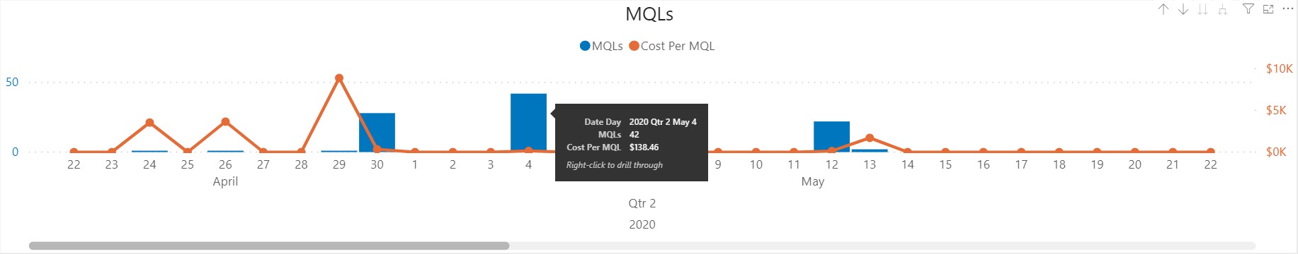
  • Total MQLs and Cost Per MQL
  • Total SALs and Cost Per SAL
  • Total MQOs and Cost Per MQO
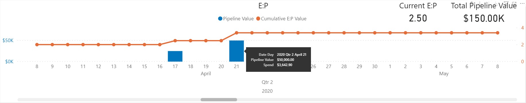
  • Total Pipeline Value and the cumulative E:P value
  • Total Won deals and the cumulative E:R value
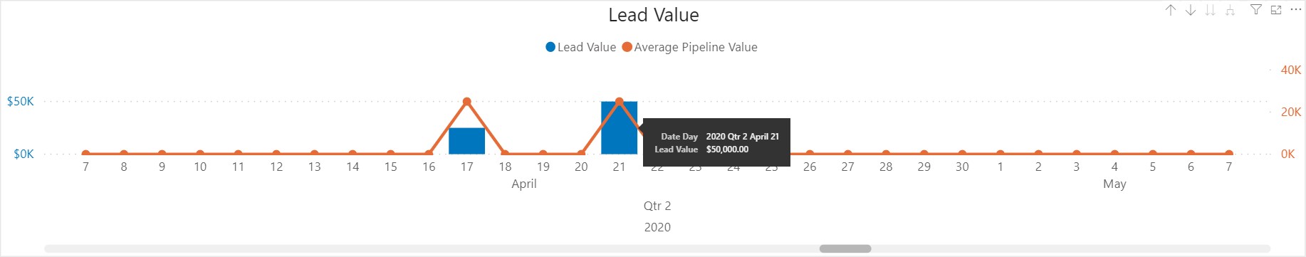
  • Total lead value and the average pipeline value
  • Data breakdown of each of the creatives codes for the campaign such as impressions, clicks, CTR etc...

General details regarding dates

Each chart is broken down on a daily basis by default and can be changed using the chart settings.

The date used to track the spend and clicks uses the click date of the advert however, the dates for leads that have entered into WMS work slightly differently. If the DigitalUniqueID is present in the WMS then the report is able to use the click date of the advert. However, if the DigitalUniqueID is not in WMS then the report has no way of knowing the click date of the advert and instead uses the created date of the process in WMS.

General details regarding Sync

Why does this report need syncing? 

In order to generate the report, we get the data from different sources (Digital & WMS) and bring it together within a Data Warehouse. So, in order to ensure this data marries up correctly, we need to synchronise the data at a set time. This ensures that the calculations in the report are accurate. The report is synced on a daily basis.

Last Sync Date Time - This displays the last date & time the data was synchronised in the Data Warehouse. 

Next Sync Date Time - This displays the next date & time the data will be synchronised in the Data Warehouse. 

INQ to SQO dates

The total number of INQs / MQLs / SALs / SQOs for a given date is based on the date the lead was created, not the date it was moved to the relevant funnel stage.

Example: There are a total of 5 SQOs for 4th May, this means that there were 5 leads created on the 4th May and have since progress to SQO.

You might also notice that in some reports INQs and MQLs seem to “bunch up” and all be delivered on one day (e.g. May 4th). That is very strange, given the evenness of the campaign spend and clicks....

However this is quite easily explained!

The INQ to SQO dates are dependant on a process having a DigitalUniqueID. If the DigitalUniqueID is present in the process then the report is able to get the actual date of the contact clicking the advert and submitting the form. However, if the process does not have a DigitalUniqueID then the report has no way of joining to the AdSpend table so as a fallback we use the process created date.

The reason you see a large grouping of leads on days such as 4th May is because the leads are bulk imported into WMS from Salesforce. This means that you will see large groups of data aligned with the frequency with which EIMS bulk import data into WMS if the processes do not have a DigitalUniqueID.

... And we can avoid the "bunch up" of INQs and MQLs by using data sync to get the DigitalUniqueID for each record into the system as and when it is synced with the client system!

Chart Settings

The chart settings changes the granularity of the date range on the Y-axis of each chart. By default the report is displayed on a daily basis however, you can change this by clicking 1 of the 4 view by buttons, your options are:

  • Year - Groups each chart on a yearly basis
  • Quarter - Groups each chart on calendar quarter.
    • Q1 - January - March
    • Q2 - April - June
    • Q3 - July - September
    • Q4 - October - December
  • Month - Groups each chart by calendar month.
  • Day - Groups each chart on a daily basis for the duration of the campaign.

Spend

  • Blue columns - Shows the amount spent for the date range selected - daily, monthly, quarterly, or yearly.
  • Orange line - Shows the total spend as the campaign progresses from start to finish, this is labelled as the Cumulative Spend.
  • Tooltip - Hover over the blue column will produce a tooltip for the selected range. The tooltip will display the following details for the highlighted range:
    • The date highlighted with the selected range.
    • The amount spent for the highlighted date.
    • The cumulative spend at the time of the highlighted date.
    • The Cost Per Lead (CPL) for the highlighted date.

Ad Click

  • Blue columns - Shows the total clicks for the date range selected - daily, monthly, quarterly, or yearly.
  • Orange line - Shows the cost per click for the date range selected - daily, monthly, quarterly, or yearly.
  • Tooltip - Hover over the blue column will produce a tooltip for the selected range. The tooltip will display the following details for the highlighted range:
    • The total clicks for the highlighted date range.
    • The cost per click for the highlighted date range.

INQs

  • Blue columns - Shows the total INQs for the date range selected - daily, monthly, quarterly, or yearly.
  • Orange line - Shows the cost per INQ for the date range selected - daily, monthly, quarterly, or yearly.
  • Tooltip - Hover over the blue column will produce a tooltip for the selected range. The tooltip will display the following details for the highlighted range:
    • The total INQs for the highlighted date range.
    • The cost per INQ for the highlighted date range.

MQLs

  • Blue columns - Shows the total MQLs for the date range selected - daily, monthly, quarterly, or yearly.
  • Orange line - Shows the cost per MQLs for the date range selected - daily, monthly, quarterly, or yearly.
  • Tooltip - Hover over the blue column will produce a tooltip for the selected range. The tooltip will display the following details for the highlighted range:
    • The total MQLs for the highlighted date range.
    • The cost per MQL for the highlighted date range.

SALs

  • Blue columns - Shows the total SALs for the date range selected - daily, monthly, quarterly, or yearly.
  • Orange line - Shows the cost per SAL for the date range selected - daily, monthly, quarterly, or yearly.
  • Tooltip - Hover over the blue column will produce a tooltip for the selected range. The tooltip will display the following details for the highlighted range:
    • The total SALs for the highlighted date range.
    • The cost per SAL for the highlighted date range.

SQOs

  • Blue columns - Shows the total SQOs for the date range selected - daily, monthly, quarterly, or yearly.
  • Orange line - Shows the cost per SQO for the date range selected - daily, monthly, quarterly, or yearly.
  • Tooltip - Hover over the blue column will produce a tooltip for the selected range. The tooltip will display the following details for the highlighted range:
    • The total SQOs for the highlighted date range.
    • The cost per SQO for the highlighted date range.

E:P

  • Blue columns - Shows the total pipeline value for the date range selected - daily, monthly, quarterly, or yearly.
  • Orange line - Shows the cumulative E:P for the date range selected - daily, monthly, quarterly, or yearly.
  • Tooltip - Hover over the blue column will produce a tooltip for the selected range. The tooltip will display the following details for the highlighted range:
    • The total pipeline value for the highlighted date range.
    • The spend for the highlighted date range.
  • E:P Calculation = Pipeline Value / Cost

E:R

  • Blue columns - Shows the won deal value for the date range selected - daily, monthly, quarterly, or yearly.
  • Orange line - Shows the cumulative E:R value for the date range selected - daily, monthly, quarterly, or yearly.
  • Tooltip - Hover over the blue column will produce a tooltip for the selected range. The tooltip will display the following details for the highlighted range:
    • The won deal value for the highlighted date range.
    • The spend for the highlighted date range.
  • E:R Calculation = Won Value / Cost

Lead Value

  • Blue columns - Shows the lead value for the date range selected - daily, monthly, quarterly, or yearly.
  • Orange line - Shows the average pipeline value for the date range selected - daily, monthly, quarterly, or yearly.
  • Tooltip - Hover over the blue column will produce a tooltip for the selected range. The tooltip will display the following details for the highlighted range:
    • The lead value for the highlighted date range.
help_outline
close