Why make forms a great user experience?
You can design process flows and make them “come alive” as web apps using WMS
The wonderful process flows you create won’t “feel” wonderful if they look clunky.
There is styling for WMS web forms in line with the eims.biz website that you can use to “beautify” your processes and make them look and feel as good as they really are.
There are beautification templates for each webplatform.
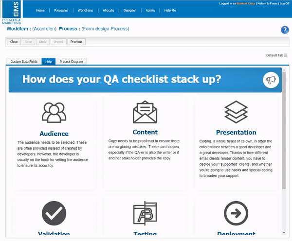
- In Asset Manager you will find 4 Form templates:
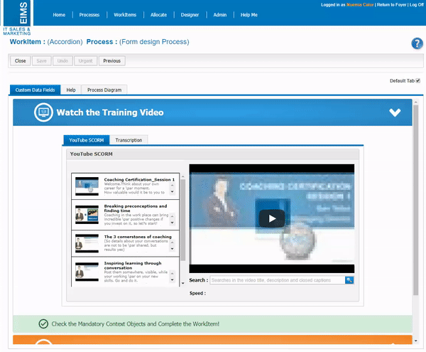
- Accordion
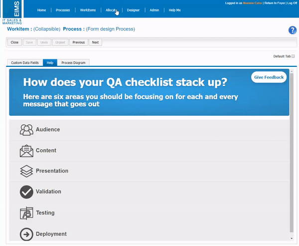
- Collapsible
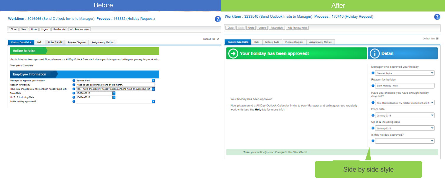
- Side by Side
- Clickable tabs
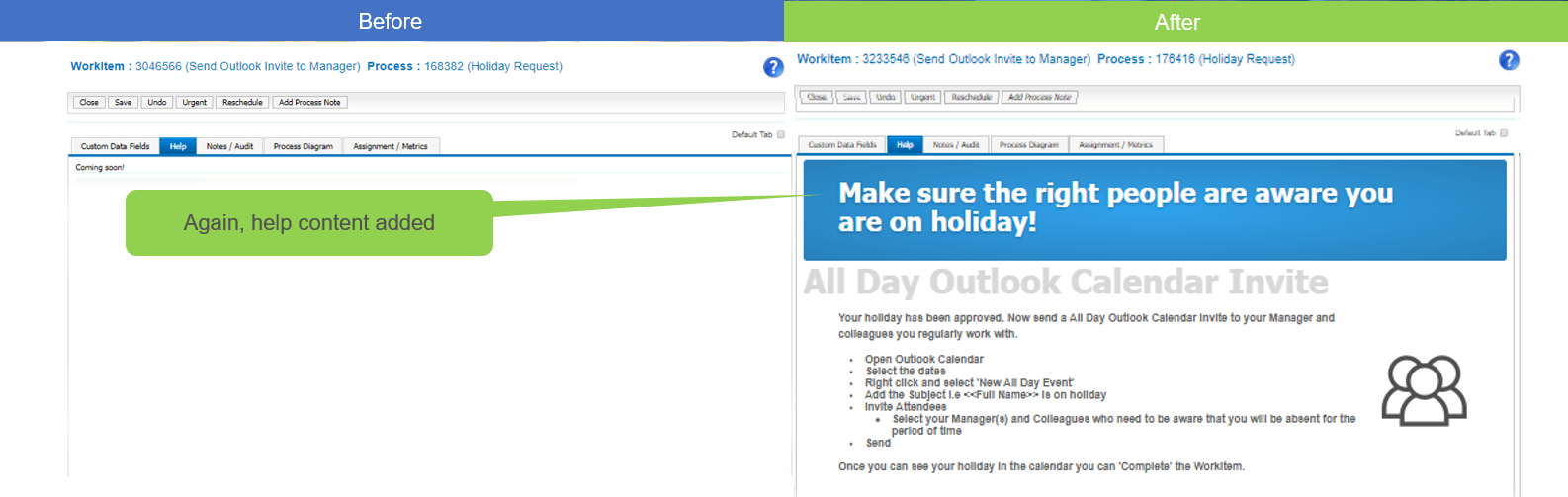
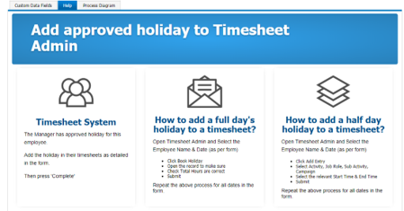
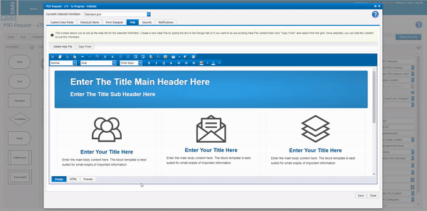
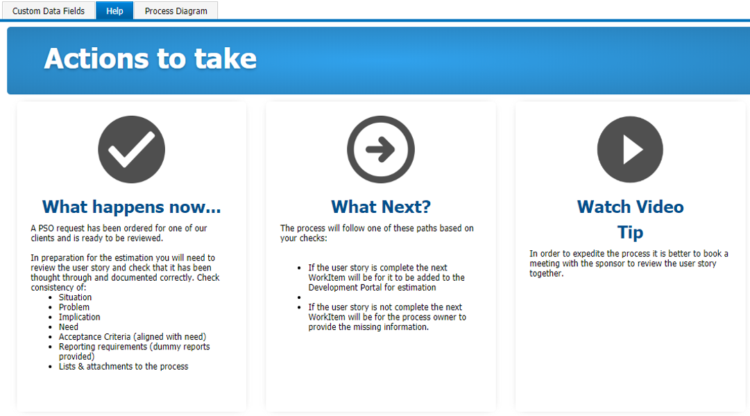
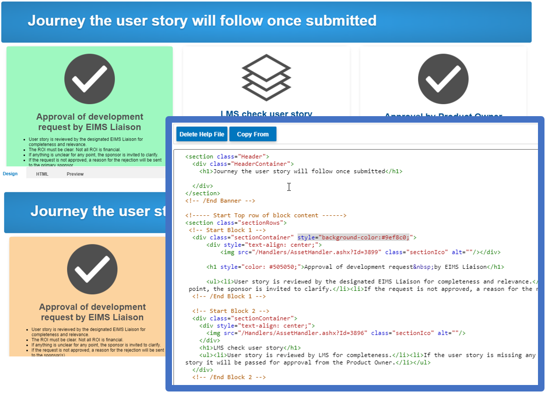
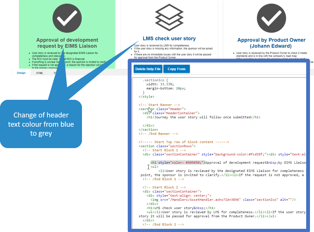
- In Asset Manager you will find 3 Help templates:
- Big-fat
- Collapsible
- Grid
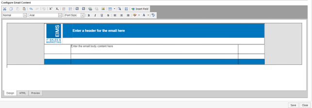
- In Asset Manager you will find 1 email template.
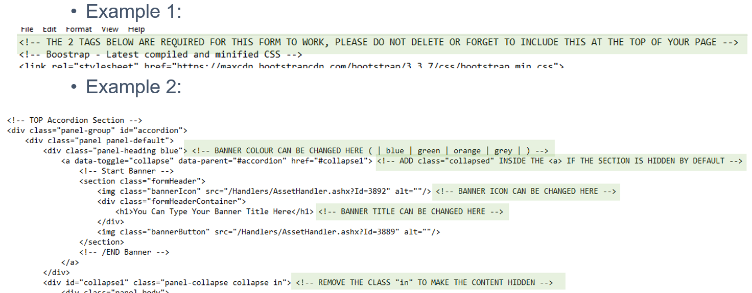
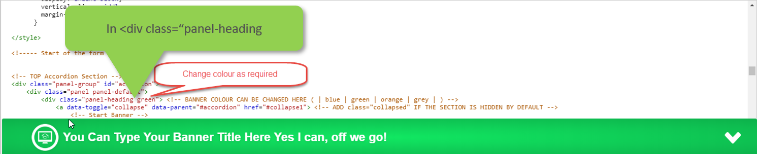
Each template is in html format, with built-in instructions to tailor it to your needs
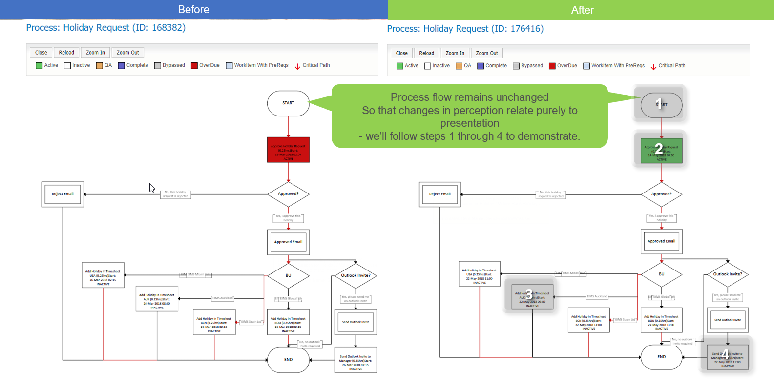
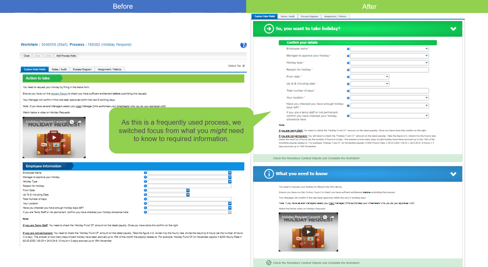
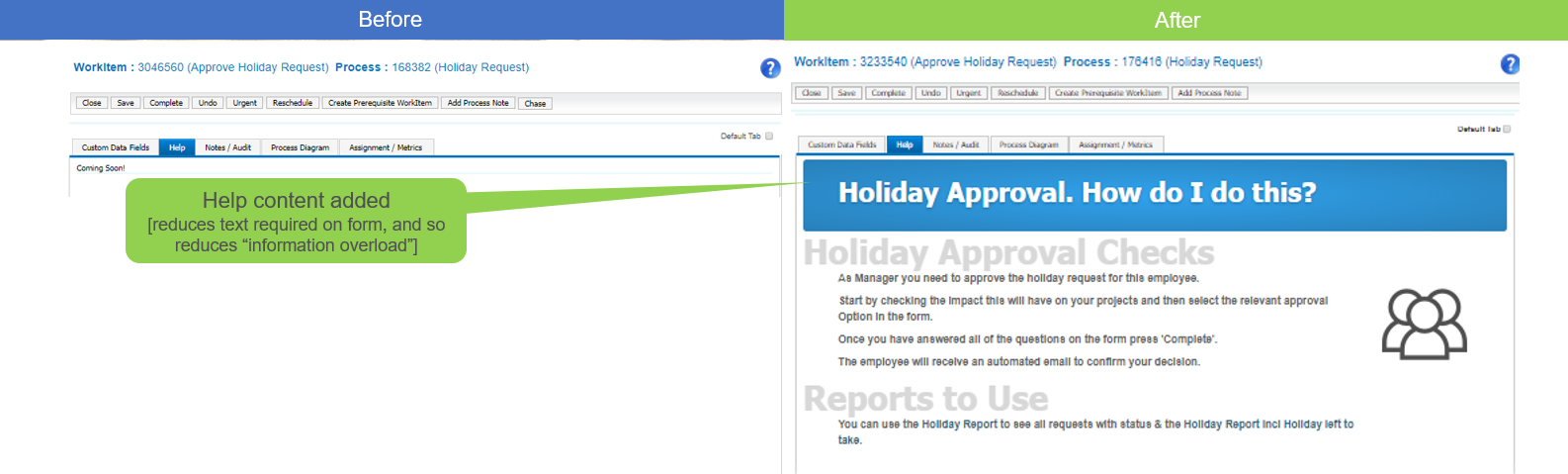
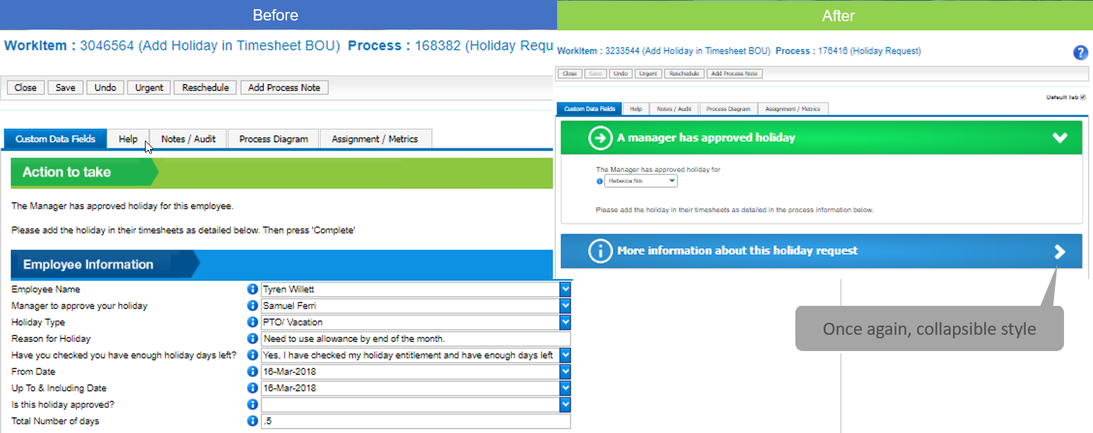
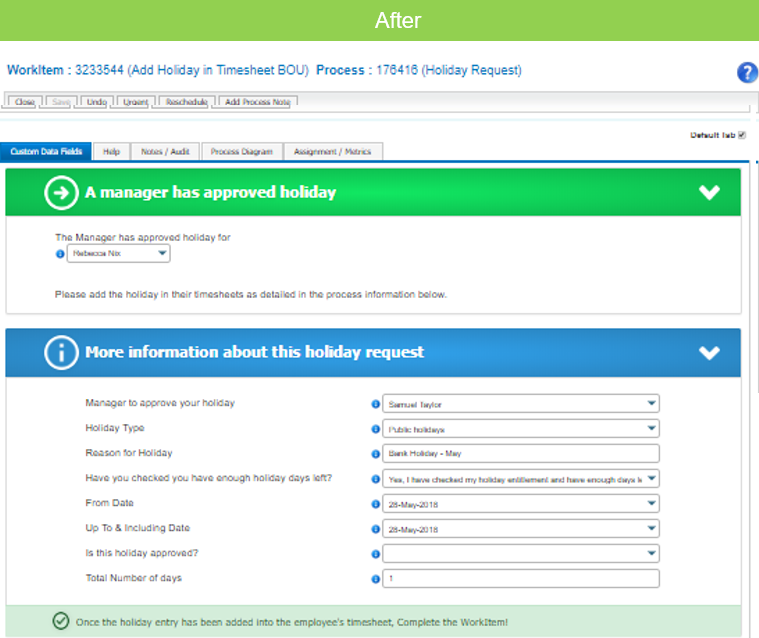
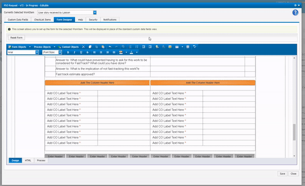
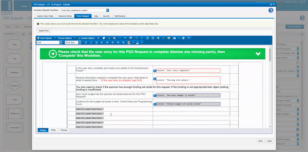
As an example we have implemented all of the above in the “Holiday Request” process on EIMS’ webplatform.
Note: If you are working on any other webplatform, ask support to supply you with beautification templates customised to your webplatform